I Didn’t Frost the Glass
How a privacy problem became a portrait, and why the safe answer would have been the wrong one.
Two pieces ago I argued that a designer’s real job doesn’t change when the tools do — that the instrument is just the instrument, and the judgment sits somewhere the software can’t reach. Last time I showed that on a photography brief. This time it’s a wall of glass.
The brief was small and specific. A meeting room on the third floor, built almost entirely of glass, sitting in the middle of an open-plan floor. People inside felt watched; people outside got no visual rest from a room that was always, faintly, on display. The room needed privacy. That’s a solved problem — you frost the glass, you apply a pattern film, you move on.
I want to explain why I didn’t move on, because the interesting decision happened before any film was ordered.
The safe answer, and why I didn’t take it
The default solution to a glass privacy problem is an abstract one. Dots, gradients, a band of frosting at eye height, a geometric texture. It works, it’s cheap, nobody objects to it, and it says absolutely nothing. That last part is usually considered a feature.
But the client here wasn’t a bank. It was Joblinge — an organisation whose whole reason for existing is the young people who walk through its doors, many of them from exactly the generation whose visual language is loud, specific, and deeply felt. A neutral geometric film would have solved the privacy problem and quietly told everyone in that building that the space wasn’t really speaking to them. The safe answer was available. It was also, for this room, the wrong one.
So the actual design question wasn’t “how do I obscure this glass.” It was “who is this room for, and what would they recognise as theirs.”
Finding the common ground
This is the part of the process I care most about, and it’s the part no tool does for you: sitting with the client long enough to understand not what they asked for, but what they meant.
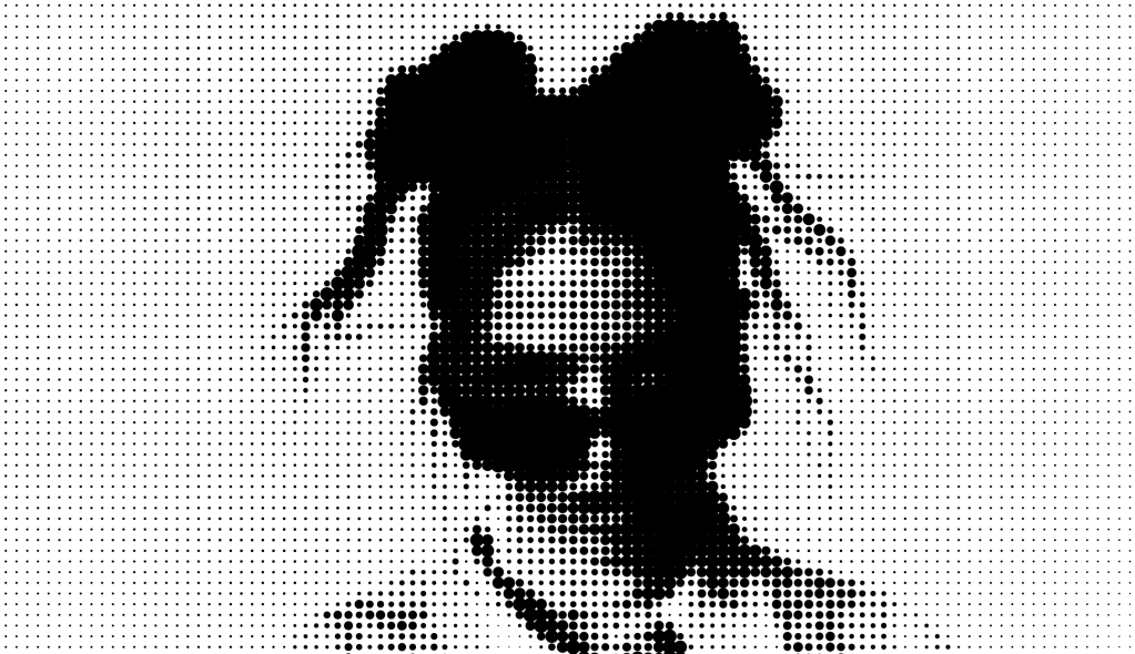
The answer I arrived at was a face. Not an abstract pattern — a portrait, drawn from the world of a Gen-Z musical artist whose work and attitude map almost exactly onto the mindset of the people who use the building. Someone that cohort would clock instantly and an outsider might simply read as a striking image. The reference did double duty: to the young people inside, a signal that the space knew who they were; to everyone else, a bold graphic that happened to also do its job.
That’s the common ground. The privacy film stopped being a neutral utility and became a statement of belonging — without ever announcing itself as one.
Where the instrument comes in
Here’s the elegant part, and it’s why this project belongs in this series.
The privacy doesn’t come from a layer added on top of the image. The privacy is the image. I took the source portraits and ran them through Adobe’s vectorisation into a halftone dot structure — the same principle as newsprint, where a continuous tone becomes a field of black dots of varying size. Up close, near the glass, the dots are open enough to see through. From across the room, they resolve into a face. The exact mechanism that grants privacy is the exact mechanism that carries the meaning. One gesture, doing both jobs.
The tool did what tools do best: it executed a transformation, at scale, cleanly. What it didn’t do — couldn’t do — was decide that a halftone face was the right answer for this room and these people. That decision came from reading the client, not from the software.
From there the work turned spatial. I mapped the vectorised portraits onto the actual room — photographs of the real glass, then 3D models of the floor — and built three full mock-up versions, each a different portrait and crop, so the client could stand in the space (virtually) and feel the difference between a downward-gazing calm and a head-thrown-back energy. Then the material call: a mirror-finish vinyl, Oracal 351, chosen because the surrounding area has glass and surfaces at every angle and reflectivity, and a mirror film blends that visual noise while still delivering the privacy the room was asking for in the first place.
An honest ending
I’ll be straight about where this project stands, because pretending otherwise would betray the whole point of writing these.
This is a proposal. As I write, the person who requested it is being moved out of that location, and the installation has maybe a fifty-fifty chance of ever going up. It may live its whole life as a set of mock-ups and a material spec.
I’m publishing it anyway, because the value of the work was never contingent on the vinyl reaching the glass. The value was in the decision not to take the safe, silent answer — in understanding a client well enough to know that a room can either ignore the people in it or recognise them, and that the difference is a design choice you have to actually make.
The instrument turned a photograph into a field of dots. Deciding whose face those dots should form was the job. It always is.
Alex Revnic is a senior graphic designer and art director based in Munich. Environmental graphics proposal, third-floor meeting room, November 2025.


Leave a Reply